CRO Case Study: Boosting Conversion Rates with Smart Design Tweaks
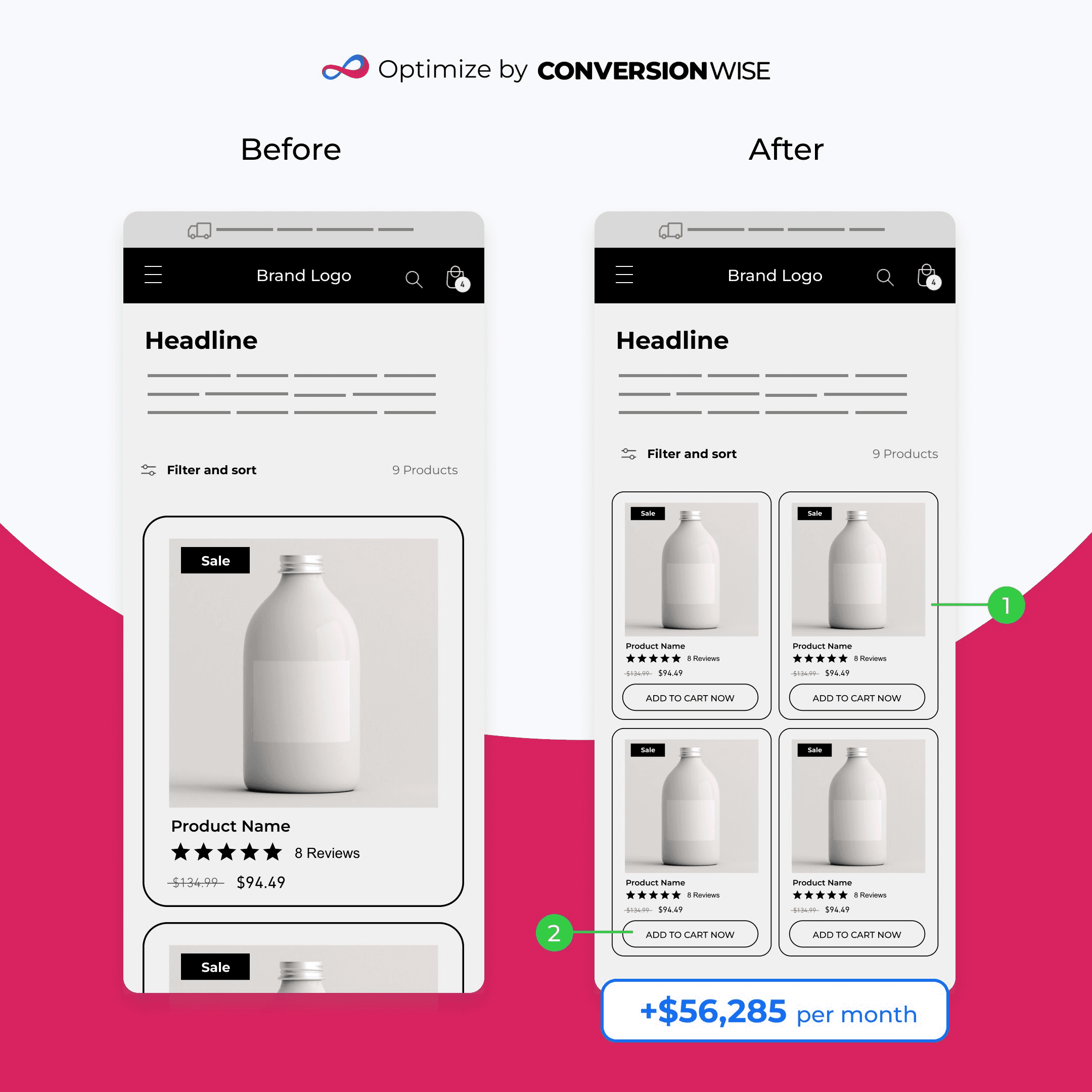
CRO case study: Mobile page layout and quick "Add to Cart" buttons led to a $56,285 monthly revenue increase, optimizing user experience and conversions.
CRO
·
4 min
76% ROI
60% REV
$90K MRR
Introduction
In today's fiercely competitive digital landscape, every eCommerce store strives to maximize its revenue and conversion rates. Conversion Rate Optimization (CRO) plays a pivotal role in achieving this goal. In this case study, we'll delve into a real-life example of how a simple AB test on an eCommerce store's collection page led to impressive revenue growth. By making intelligent design tweaks backed by data from Google Analytics, we were able to enhance user experience, reduce friction, and drive more sales.
The Problem
Our client, an eCommerce store, noticed that despite attracting a steady flow of traffic to their collection pages, their revenue per session remained stagnant. Google Analytics data showed that visitors were often navigating from product pages to other parts of the store, indicating potential usability issues. Heatmaps further revealed that a significant number of clicks were concentrated on products located lower down the page, indicating that users were likely having difficulty finding the products they were interested in.
The Solution
To address the identified problems and improve the overall user experience on the collection page, we devised a data-driven strategy backed by Conversion Rate Optimization techniques.
1. Optimizing Mobile Page Layout
Understanding that a significant portion of our client's traffic came from mobile users, we decided to focus on mobile page optimization. We reconfigured the layout of their mobile collection pages to display each product card in a smaller size, allowing us to showcase four products above the fold instead of just one. This change ensured that users could now easily compare multiple products without having to scroll extensively, thereby reducing friction and enhancing the likelihood of conversions.
2. Introducing Quick "Add to Cart" Buttons
To capitalize on users' purchase intent and make the buying process more seamless, we added a quick "Add to Cart now" button to each product card. This enabled users to make instant purchases without navigating to the product page, thereby reducing the steps required for conversion. By simplifying the checkout process, we aimed to capitalize on impulse buying behavior, further boosting the chances of conversion.
The Results

Our conversion rate optimization efforts yielded outstanding results, providing a significant boost to the client's revenue.
Monthly Revenue Gain: The A/B test resulted in a remarkable increase in revenue, adding an impressive $56,285 per month to the client's bottom line.
Annual Revenue Projection: Based on the test's success, we projected an annual revenue gain of $675,420, showcasing the long-term impact of well-implemented CRO strategies.
Revenue per Session: Perhaps the most telling metric of success, the test led to a substantial increase in revenue per session, reaching an impressive $0.28. This metric is a testament to the effectiveness of our optimization efforts in capturing user interest and encouraging conversion.

